The magazine we would create would be a very mainstream high end magazine. It could be categorized with publications such as Empire and Total Film and would be aimed at a similar audience. To Compete with such publications we will need to create a product that is comparable in terms of quality and competitively priced.
Our target audience would be the same as empire and total film, young to middle aged, affluent males and will therefore need to display, on the front cover features and articles that would be attractive to such an audience. Whilst this is our target audience we would not discriminate against other demographics that may also be interested in mainstream cinema, for example we would also feature articles about films targeted at older people, younger people and females.
TS
Showing posts with label Research and Planning. Show all posts
Showing posts with label Research and Planning. Show all posts
Thursday, 22 March 2012

Poster Planning
From the beginning we were keen to use the image of the shadow in the door as we considered it to be bold and therefore eye catching. We also wanted to incorporate a shot from the trailer, which would also be from the actual film. We took film poster conventions into account when we designed our original poster.
Below are our original rough sketch plans for the poster. We did not fully intend to use these designs but through them we came up with the basic plans for the layout of our poster.


We created a series of 6 drafts before going back and developing our 3rd draft to create the final product.
Draft 1
In the creating our first draft we chose the font ('Typewriter 1942') that would play a key part in all our drafts and the final product. we also created the billing block (font: 'Universal Accreditation) that would be copied and pasted into our other drafts. At this stage we also decided to have the actors name in the 'Universal Accreditation' font. We also came up with a catchline that was later developed. However we did not consider this draft to be strong enough to be our final draft as the grey text used and the positioning was not correct. The effects put on the main image were also not effective enough.
 |
| Draft 1 |
In draft 2 we made the transition from grey to red for the text and white for the billing block and websites.we moved the title down and put the cast at the top. We also moved the release date down to the bottom to make it more prominent. At this stage we were still deciding whether the tagline (as seen in draft 1) was appropriate for the genre. We eventually decided that a similar tagline was fine as horror films are often fairly 'tongue and cheek' in their taglines. we also took some of the filters off the main image.
 |
| Draft 2 |
Draft 3 was the draft that would later become the final product. the layout is similar. We used the smudge tool on photoshop to distort the figure in the main image in order to 'dehumanize' it. by this stage it was 2012 so we changed the release date to 'autumn 2012' and raised and enlarged it to make it even more prominent. At this stage we had another potential tagline, that was similar to the previous one. We also made the billing block slightly larger, the websites in particular. The certification and the facebook page address were added at a later stage during the transition to the final product.
 |
| Draft 3 |
We decided to make draft 4 a landscape image. We did this with the view to add more to the poster which could in turn show off more selling points of the film the the poster thus making it more effective. We added another image from the film as well as the certification of the film. We used the original doorway image as it may have looked better without the smudging but with blurred lines instead. we attempted to use a shadow effect to blend the secondary image in. We added a vertical red line to create a divide between the door way image and the rest of the poster. a
 |
| Draft 4 |
Draft five is similar to draft 4, except we decided that the smudged version of the doorway image was much more effective as it stood out more and as mentioned above it's slightly dehumanized. we also added the tagline. The secondary image was taken as a still and is not a shot from the movie. We wanted to feature the doll but not explain its meaning, whereas a shot of the character finding it may have given too much away. we found the the image did not blend well into the rest of the poster and decided to change it in draft 6.
 |
| Draft 5 |
Again draft 6 i very similar to 4 and 5. It has the same layout, being landscape rather than portrait. We changed the secondary image again to just the doll and added filters to drain the colour and lower the level of opaqueness to make it blend in more effectively and and with subtlety. We also added the orginal tagline but later decided to use the shorter, snappier version. However we then came to the decision that a portrait poster was more suitable as we felt the secondary image distracted from the strengths of the doorway image. There was also a fair amount of unessary free space.
 |
| Draft 6 |
TS
Thursday, 23 February 2012
Shooting Schedule
As our trailer involved four actors it was difficult to organise a time when they were all available to film. It was also the case that our actors had work commitments that limited our available filming slots to weekends. We also had filming sessions that had to be cancelled due to unforeseen circumstances.
This also lead to a relatively last minute change in casting of our actress as our original actress was not available at times that suited the rest of our cast and as we were running out of available weekends before our deadline a change of actress was necessary.
On our second day of filming we did not have a boom pole which made recording sound slightly more difficult as we were unable to get the microphone as close to the sound source as we would have liked to. However because there were two of us the problem was relatively easily over come.
TS
This also lead to a relatively last minute change in casting of our actress as our original actress was not available at times that suited the rest of our cast and as we were running out of available weekends before our deadline a change of actress was necessary.
On our second day of filming we did not have a boom pole which made recording sound slightly more difficult as we were unable to get the microphone as close to the sound source as we would have liked to. However because there were two of us the problem was relatively easily over come.
TS
Saturday, 4 February 2012
Wednesday, 14 December 2011
Tuesday, 13 December 2011
Sunday, 11 December 2011
Props
Clip Board/ Note Book


The estate agent will carry a clipboard with his notes on the house on it. An alternative to a clipboard may be an A4 notebook. He will also carry a pen.
Laptop


 one of the most important props in our trailer is the main character's laptop. the main character is a writer and he works on his laptop. we will see the laptop fairly early on in the trailer when he unpacks it as they move in. This will highlight to the audience that the laptop, and his work, is very important to him as it is the first thing he unpacks as they move in to a new home. he will also unpack a mug, a pad of paper and some pens.

Laptop Carrier
as the wife is in a high power job she will carry a laptop case when she comes in and out of the house in the evening and the morning.
Brief Case

The Doctor will carry a briefcase and a notepad and pen.
TS


The estate agent will carry a clipboard with his notes on the house on it. An alternative to a clipboard may be an A4 notebook. He will also carry a pen.
Laptop


 one of the most important props in our trailer is the main character's laptop. the main character is a writer and he works on his laptop. we will see the laptop fairly early on in the trailer when he unpacks it as they move in. This will highlight to the audience that the laptop, and his work, is very important to him as it is the first thing he unpacks as they move in to a new home. he will also unpack a mug, a pad of paper and some pens.
Laptop Carrier
as the wife is in a high power job she will carry a laptop case when she comes in and out of the house in the evening and the morning.
Brief Case

The Doctor will carry a briefcase and a notepad and pen.
TS
Monday, 5 December 2011
Movie Posters


 The poster for 'The Orphanage' also works well as again it tells us something about the story without giving too much away. The almost transparent characters in the background suggest that the story will be revolved around the paranormal/supernatural and the old fashioned stately home backdrop and the fact that it is made by Guillermo Del Toro suggests that it will be visually pleasing.
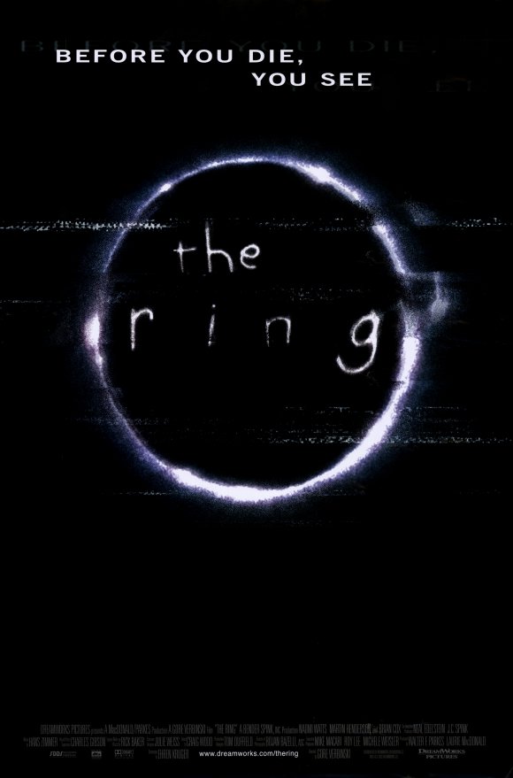
The poster for 'The Ring' is very simple yet still very chilling. The distortion in the picture gives it a creepy vibe as does the font that is used. The tagline is scary in the way that it does not give anything away except that there is something to fear. The poster tells us nothing about the cast or director outside of the billing block at the bottom suggesting that the main selling point for the film is the story line which would appeal very much to the indie film audience as they are 'too cool' to be bothered by famous actors and directors.
TS
Thursday, 24 November 2011
Graphics Influences- Fonts


The graphics used in 'The Orphanage are a little more subtle with relatively plane text on a black background. the weathered effect of the font would fit well with the tone of our film. However the 'rose stalk' that appears to extend from the latter A would not.
 |
'The Others' has a slightly more modern font but it is still relatively plane text on a dark background. this would fit in the tone of the film as it is a relatively modern horror. The light that seems to radiate from the letters gives it a modern paranormal feel.
 The font for 'The Hills Have Eyes' is also relatively simple. The block capital letters make it standout even thought it is against a coloured background. The letters seem to fade into an almost red colour (especially the S in hills) and they seem to vary slightly in size making the text more interesting than if it was just plane text. This may suit our film if it were put on to a relatively plane background.
TS
Monday, 21 November 2011
Costume
Estate Agent

Grey pinstripe trousers. They are smart but not as formal as a black pair of trousers.

A predominately red tie but with little pattern, bright but not to garish.
 Brown brogues. not overly formal but not too casual either. The estate agent is still young and will therefore care about his image.
Husband
The husband will be casually dressed throughout as he does not have a formal job.
When they are shown around the house he may wear just a T-shirt and jeans with casual trainers.


Once they have moved in he will mostly wear plain pyjama trousers and a t-shirt, possibly with a dressing gown and slippers to take away the divide between day and night and to show his abnormal behaviour, as most people get dressed during the day.


Wife
The wife will be dressed very formally throughout as she is a high powered business woman. she will therefore be dressed in a formal business suit for almost the entirety of the trailer.

Doctor

 The doctor will be dressed in very smart clothes as he is in a formal profession. He will probably wear a smart suit and a beige work coat with smart work shoes and a tie.

As the estate agent is trying to impress the couple to encourage them to buy the house, he will therefore be 'dressed to impress'. He will be dressed in:


A blue shirt with white collars and cuffs, often seen on young inexperienced businessmen.

Grey pinstripe trousers. They are smart but not as formal as a black pair of trousers.
A predominately red tie but with little pattern, bright but not to garish.

Husband
The husband will be casually dressed throughout as he does not have a formal job.
When they are shown around the house he may wear just a T-shirt and jeans with casual trainers.


Once they have moved in he will mostly wear plain pyjama trousers and a t-shirt, possibly with a dressing gown and slippers to take away the divide between day and night and to show his abnormal behaviour, as most people get dressed during the day.


Wife
The wife will be dressed very formally throughout as she is a high powered business woman. she will therefore be dressed in a formal business suit for almost the entirety of the trailer.

Doctor

 The doctor will be dressed in very smart clothes as he is in a formal profession. He will probably wear a smart suit and a beige work coat with smart work shoes and a tie.
TS
Shutter Island- Symphony No. 3 Passacaglia- Allegro Moderato
This music is brooding and sinister which would fit with the tone of our film. It is also fairly slow paced which keeps tension. As the fear created in our film would be more based around tension than action this would be appropriate fast paced music, however, would be inappropriate. We particularly like the effect of the loud horn sounds at the beginning and we will try to find music that replicates this.
TS + JT
Wednesday, 9 November 2011
Studio
because of the nature of horror films the audience is fairly limited. it would therefore be beneficial for us to extend our audience internationally. As we want to avoid using a mainstream Hollywood production company. To extend our audience internationally, in particular to the United States (where the biggest market for the horror genre is), we would therefore need to use two production companies. One would be a British independent production company and the other would be an 'indiewood' production company.
UK production company: Hammer Film Productions:
Hammer Film Productions are a UK based company that are well known for making low key, not overdramatic, horror films. recently the have produced "The Woman in Black" a film about a man in an isolated position who falls victim to the serial and the supernatural, a film similar in style and tone to our own. The company has recently made a come back after a long pause between films. A UK based company will also allow us to tap into the mainland european market.
http://www.imdb.com/company/co0103101/
 US production company: Ghost House Pictures
Ghost house pictures is a US based company that specialises in Horror movies. although the horrors that they make are more high key they will allow us to release our film in the US with a greater chance of success as this is where the greatest market for horror films is. the company is known for films including The Grudge series, Drag Me to Hell and 30 Days of Night amongst many others.

http://www.imdb.com/company/co0116611/
TS
UK production company: Hammer Film Productions:
Hammer Film Productions are a UK based company that are well known for making low key, not overdramatic, horror films. recently the have produced "The Woman in Black" a film about a man in an isolated position who falls victim to the serial and the supernatural, a film similar in style and tone to our own. The company has recently made a come back after a long pause between films. A UK based company will also allow us to tap into the mainland european market.
http://www.imdb.com/company/co0103101/

Ghost house pictures is a US based company that specialises in Horror movies. although the horrors that they make are more high key they will allow us to release our film in the US with a greater chance of success as this is where the greatest market for horror films is. the company is known for films including The Grudge series, Drag Me to Hell and 30 Days of Night amongst many others.

http://www.imdb.com/company/co0116611/
TS
Monday, 10 October 2011
Location


The use of this window could prove to be very effective. There are curtians behind which something/someone could appear from the garden, but upon inspection in the room, it is clear that no such intruder was present.


So we see a young couple led round a delightful looking house in suburbia
It soon becomes clear that things arent as they seemed at first...


sillouhettes in doors- created simply with someone standing behind the glass panel and the light behind them showing an outline of their form.
JT
Subscribe to:
Posts (Atom)